Avasa
Case study
↓

Architecture has rules. Good branding knows which ones to break.
Real estate branding usually tries to say too much.
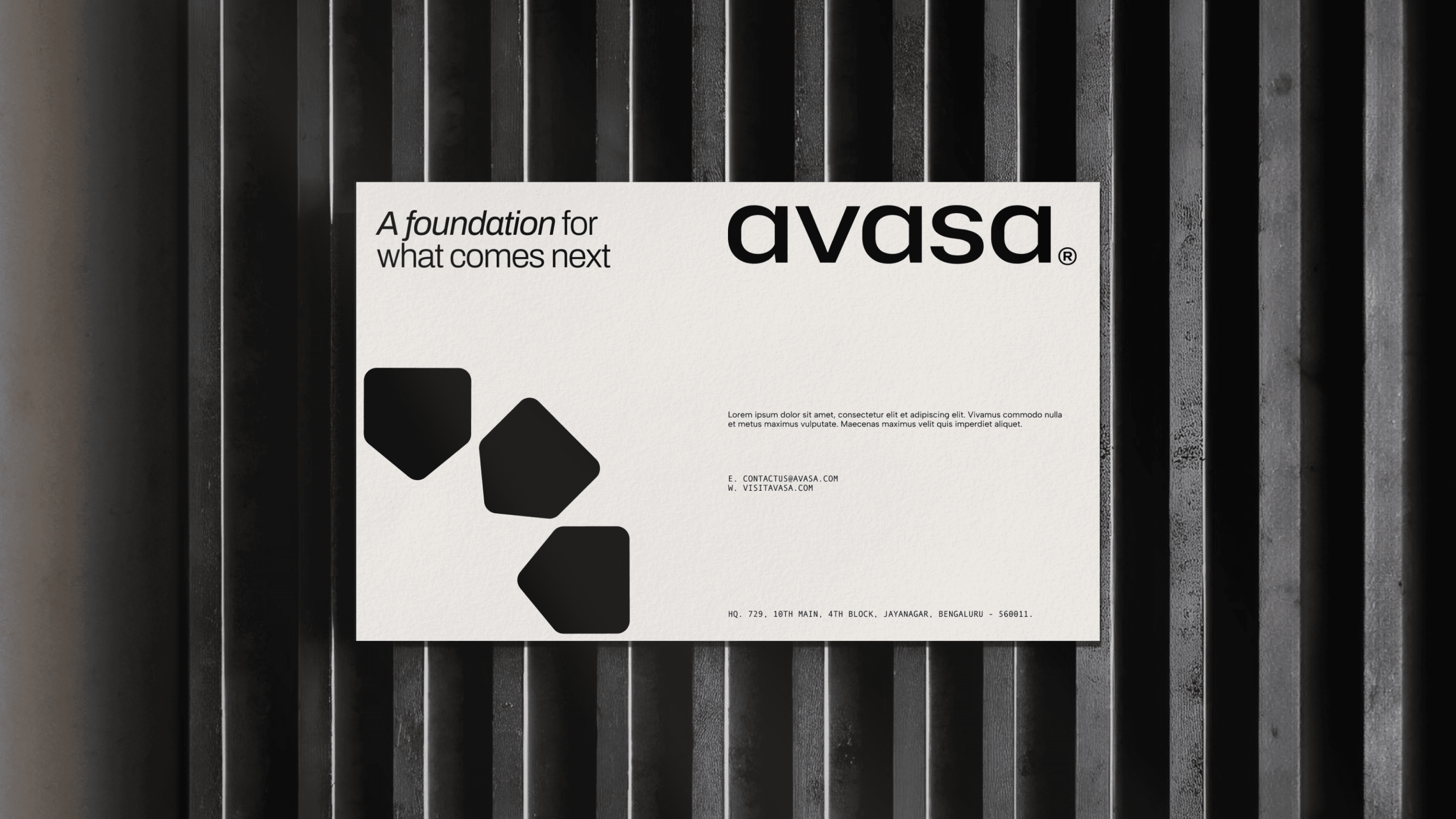
It leans heavily on aspiration: grand claims, visual excess, and a constant push to impress. For Avasa, the approach was the opposite. Strip it back. Focus on what matters. A brand that reflects a shift towards more purposeful, future-ready development.
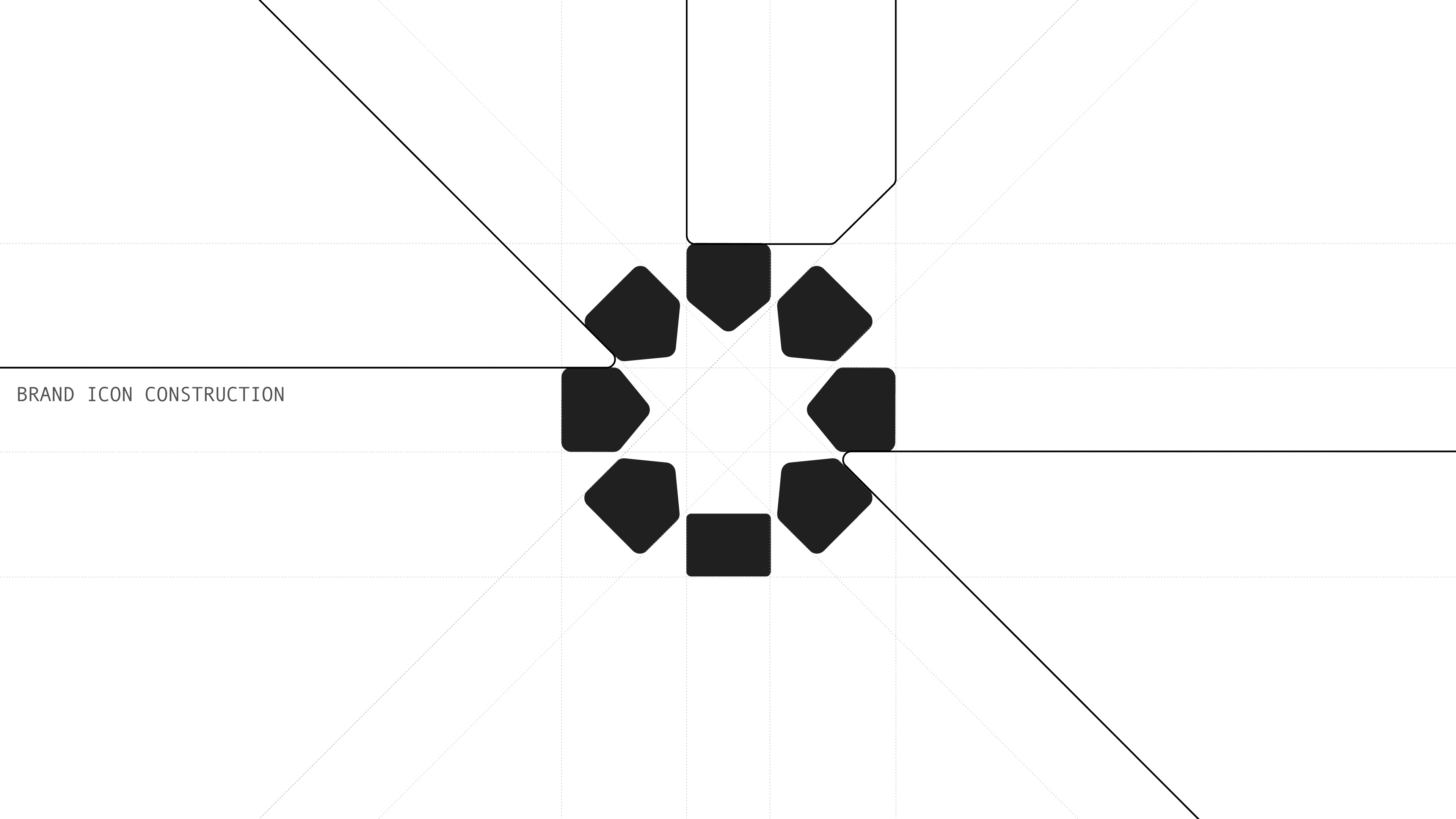
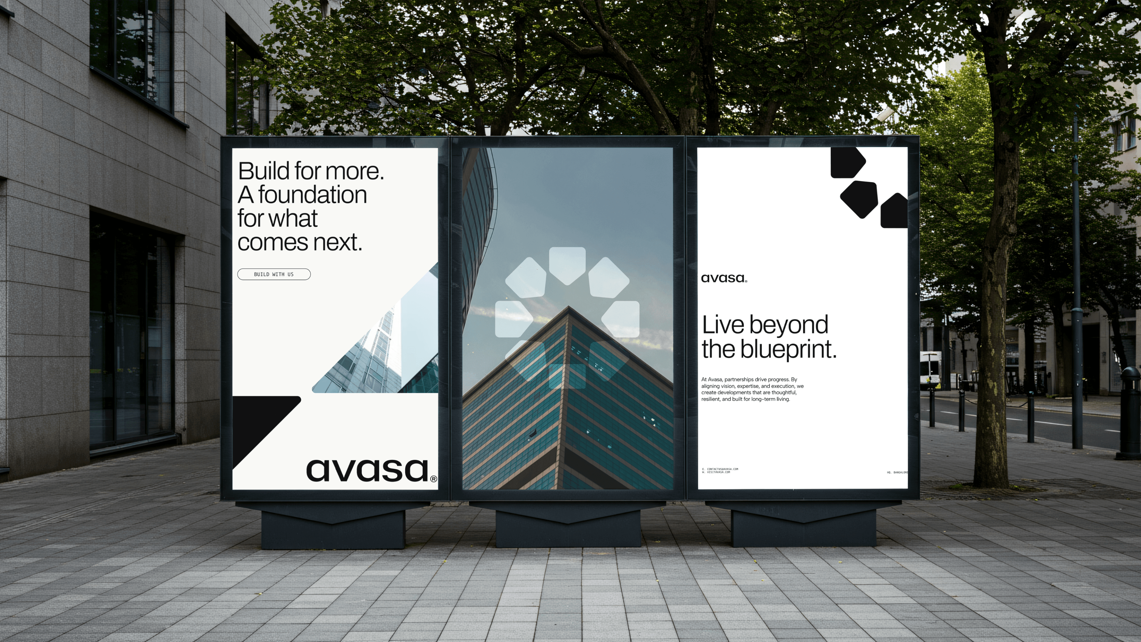
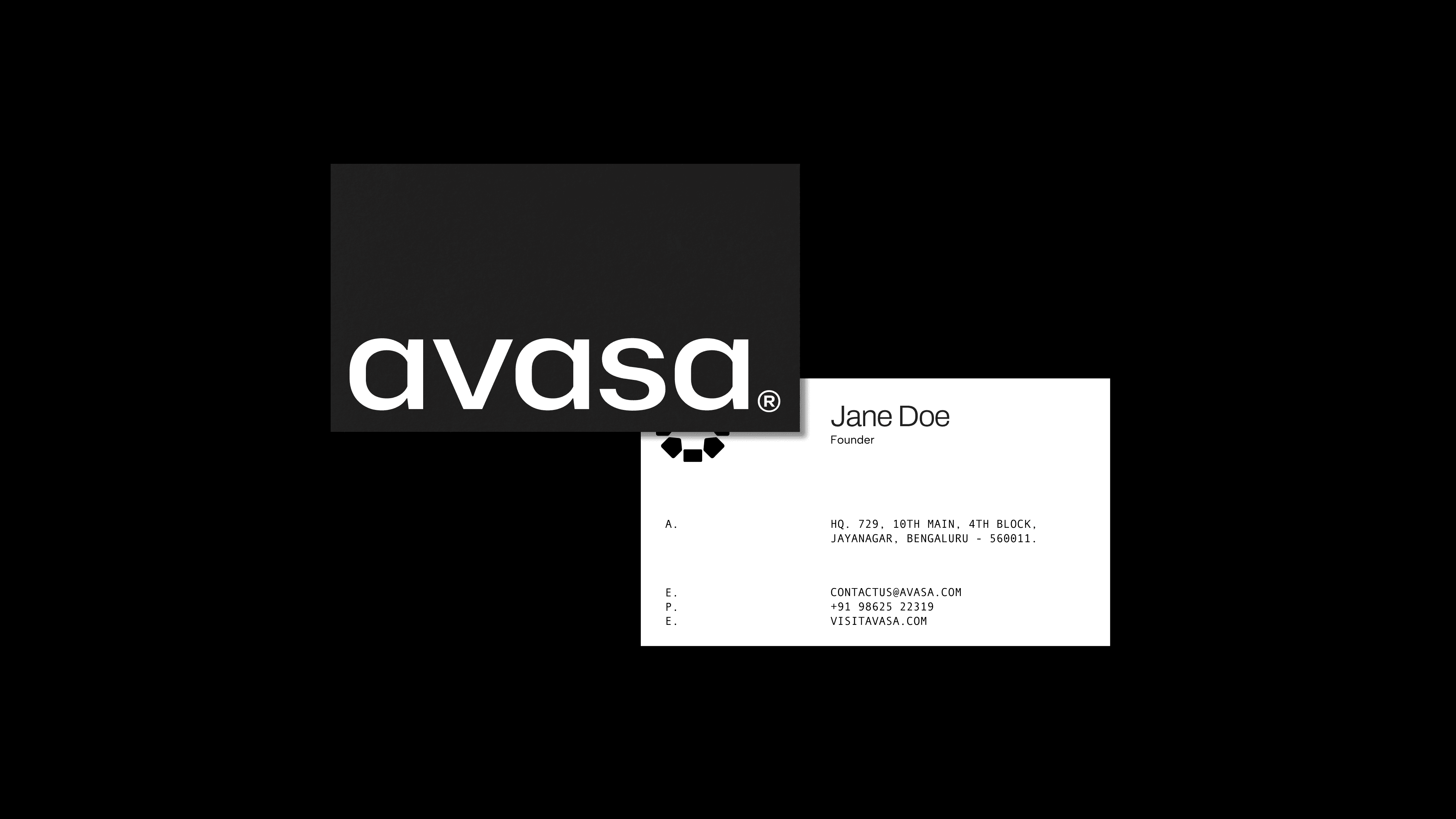
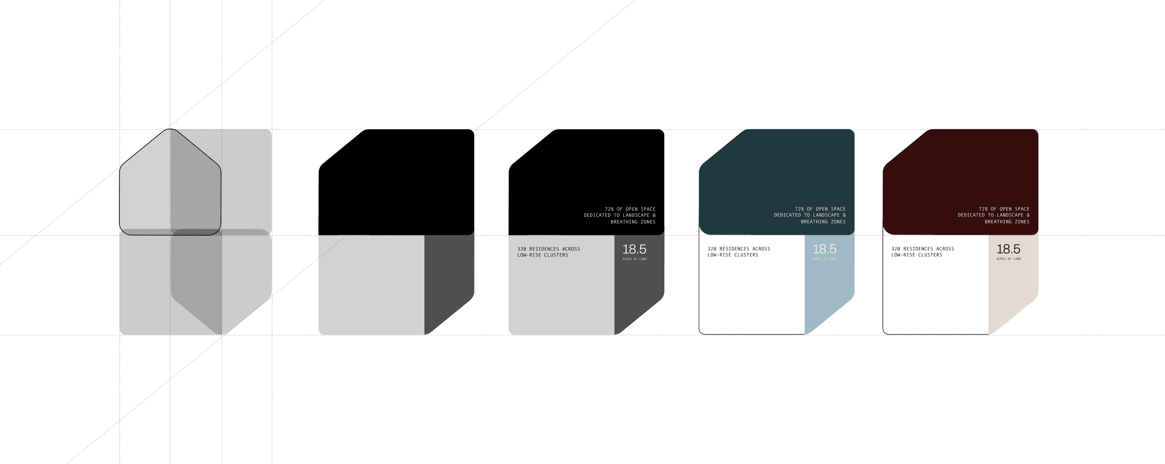
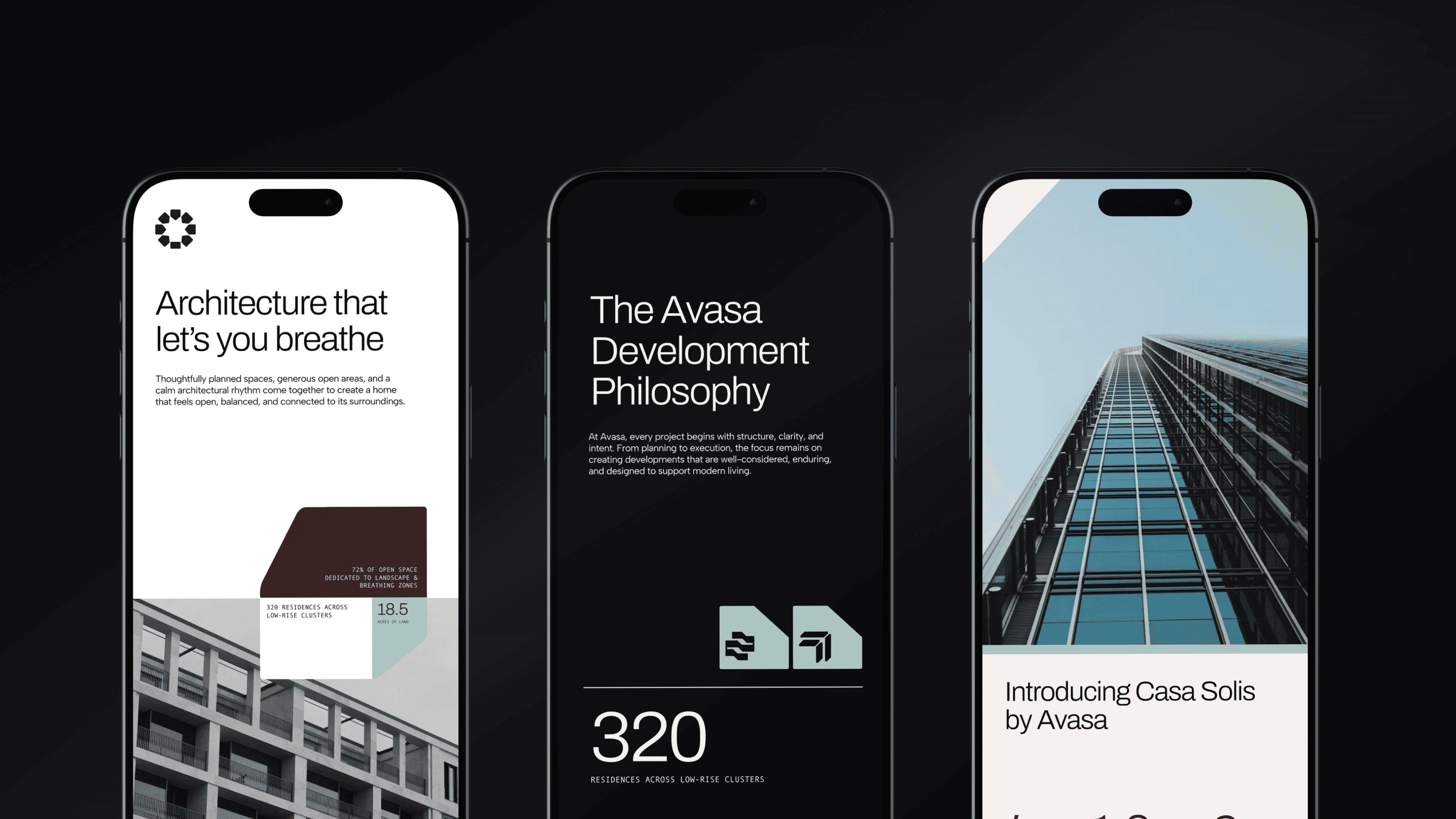
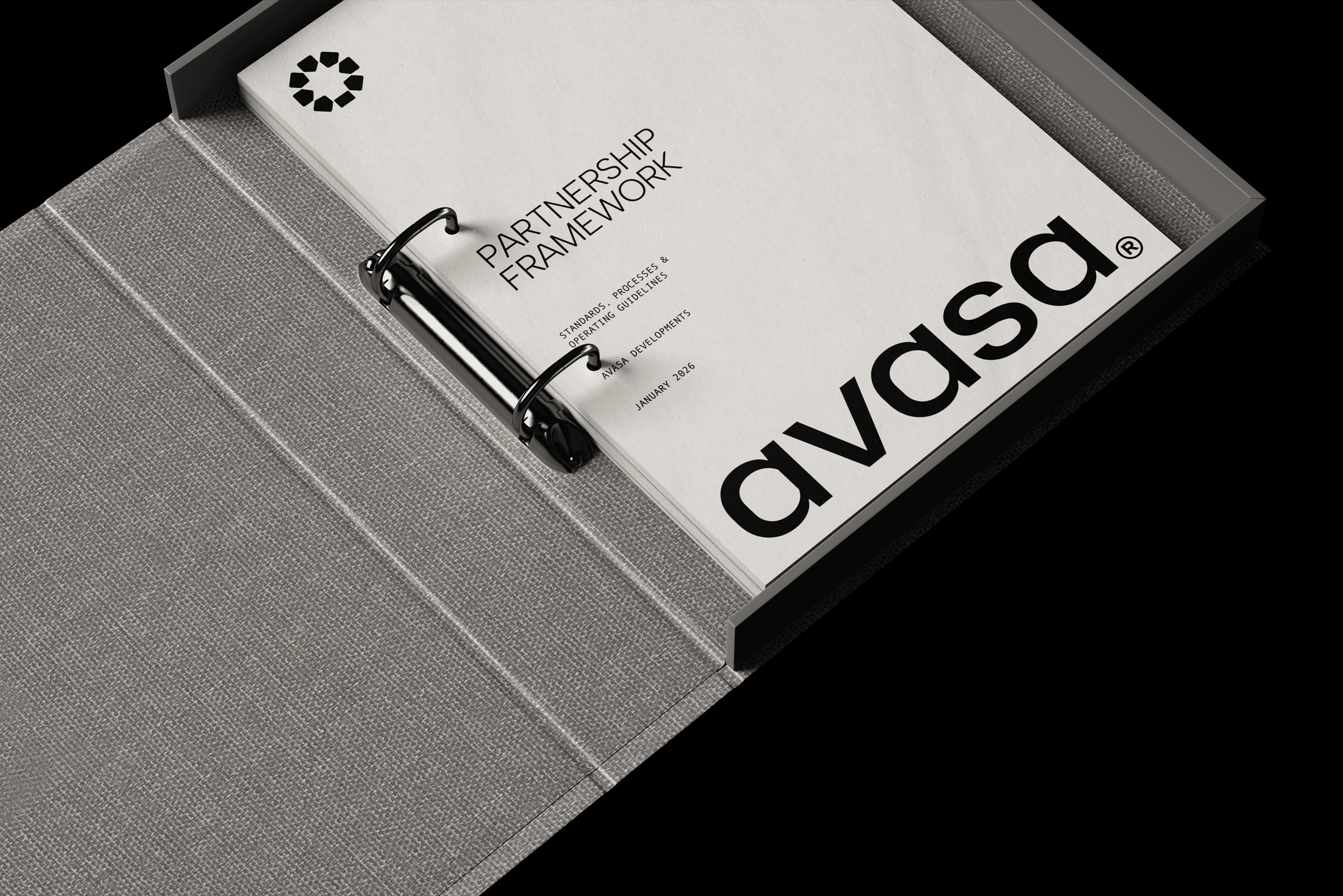
The challenge was to create an identity that holds two things at once: the discipline of architecture and the fluidity of modern living. Rooted in geometry and precision, the brand extends beyond a logo into a cohesive graphic language that feels deliberate, adaptable, and built for the future of urban development.
Client
Avasa
Services
Brand Strategy, Brand Identity, Brand Guidelines
Year
2026
Work Produced For
Coconat Creatives