Cosmix
Case study
↓

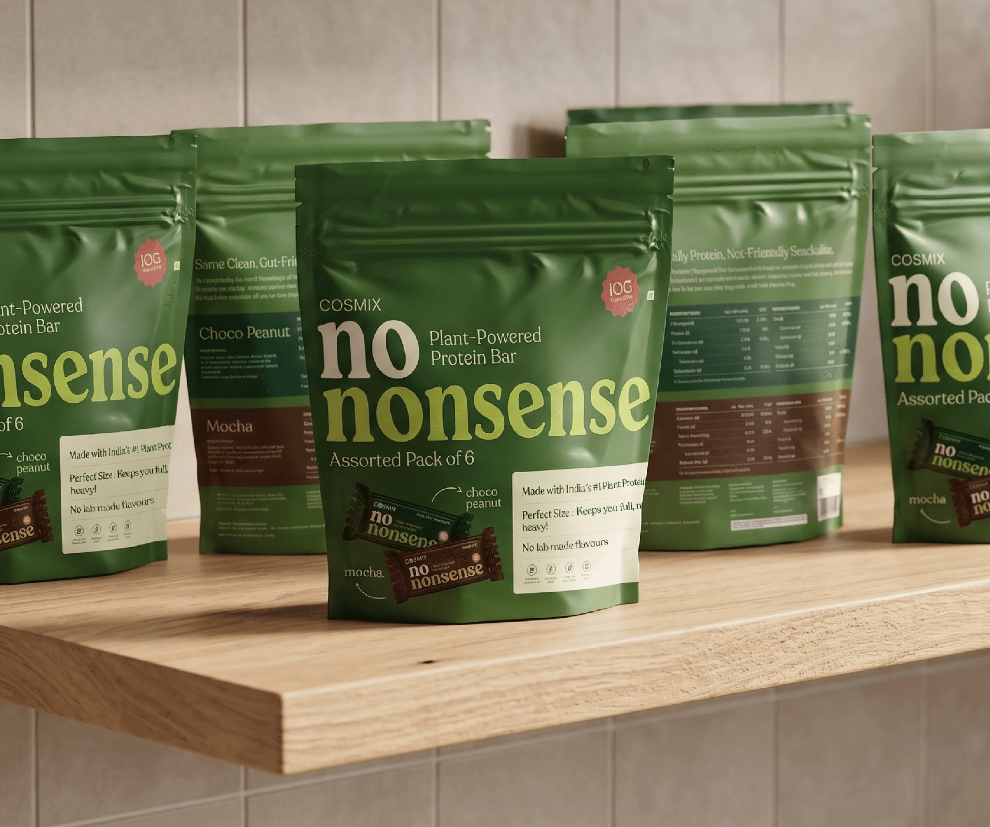
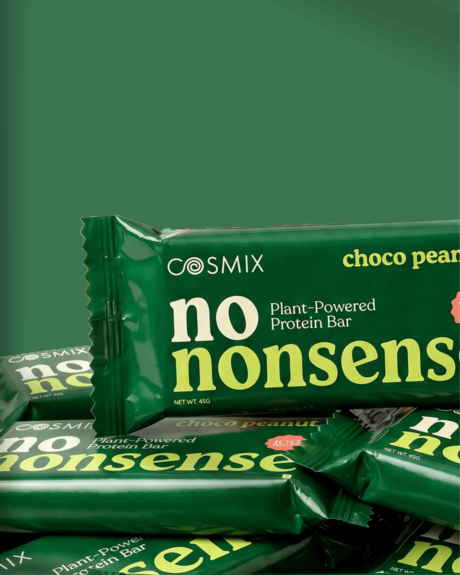
Same DNA. More Presence.
The wellness aisle is fighting for your attention.
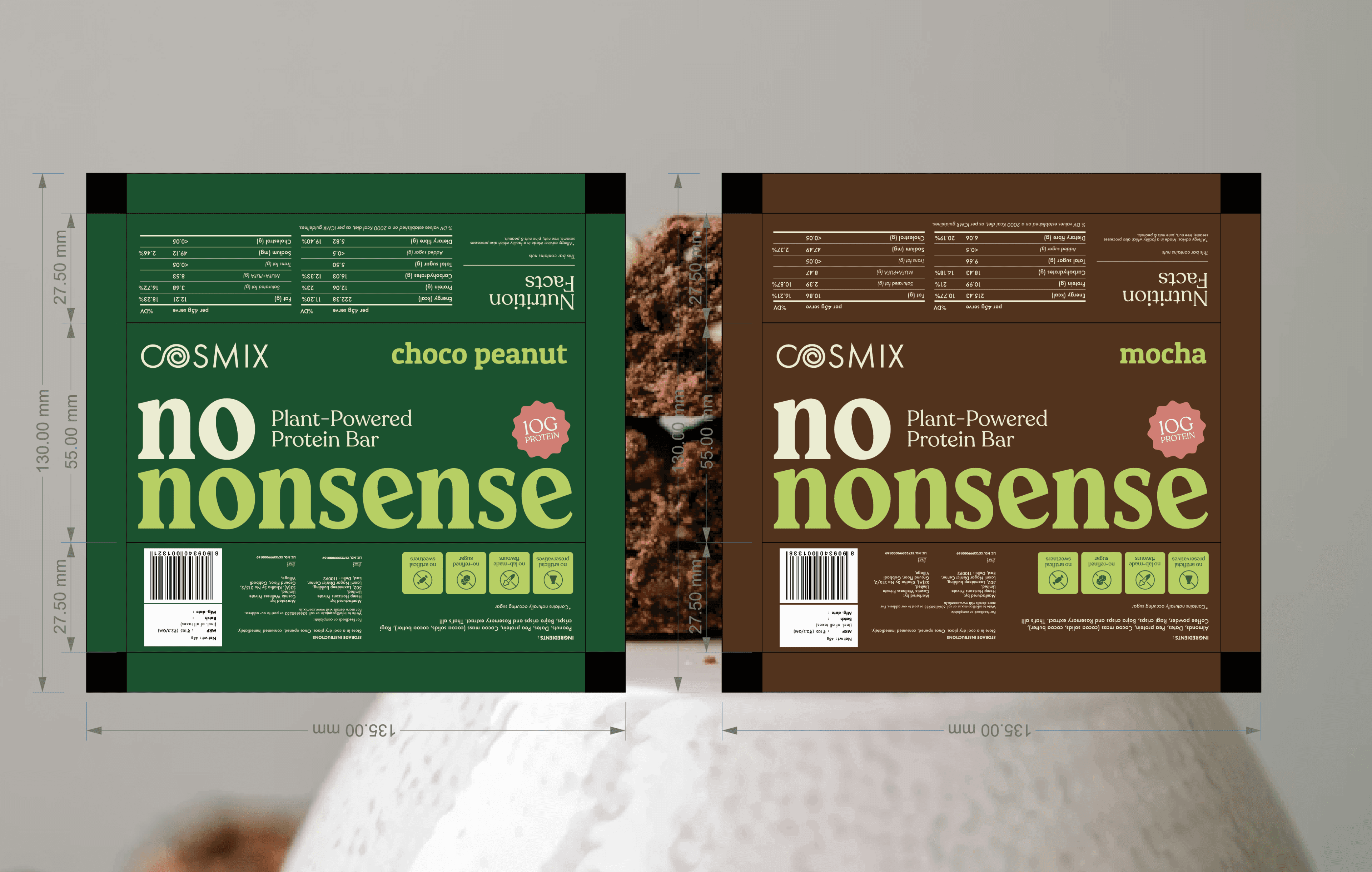
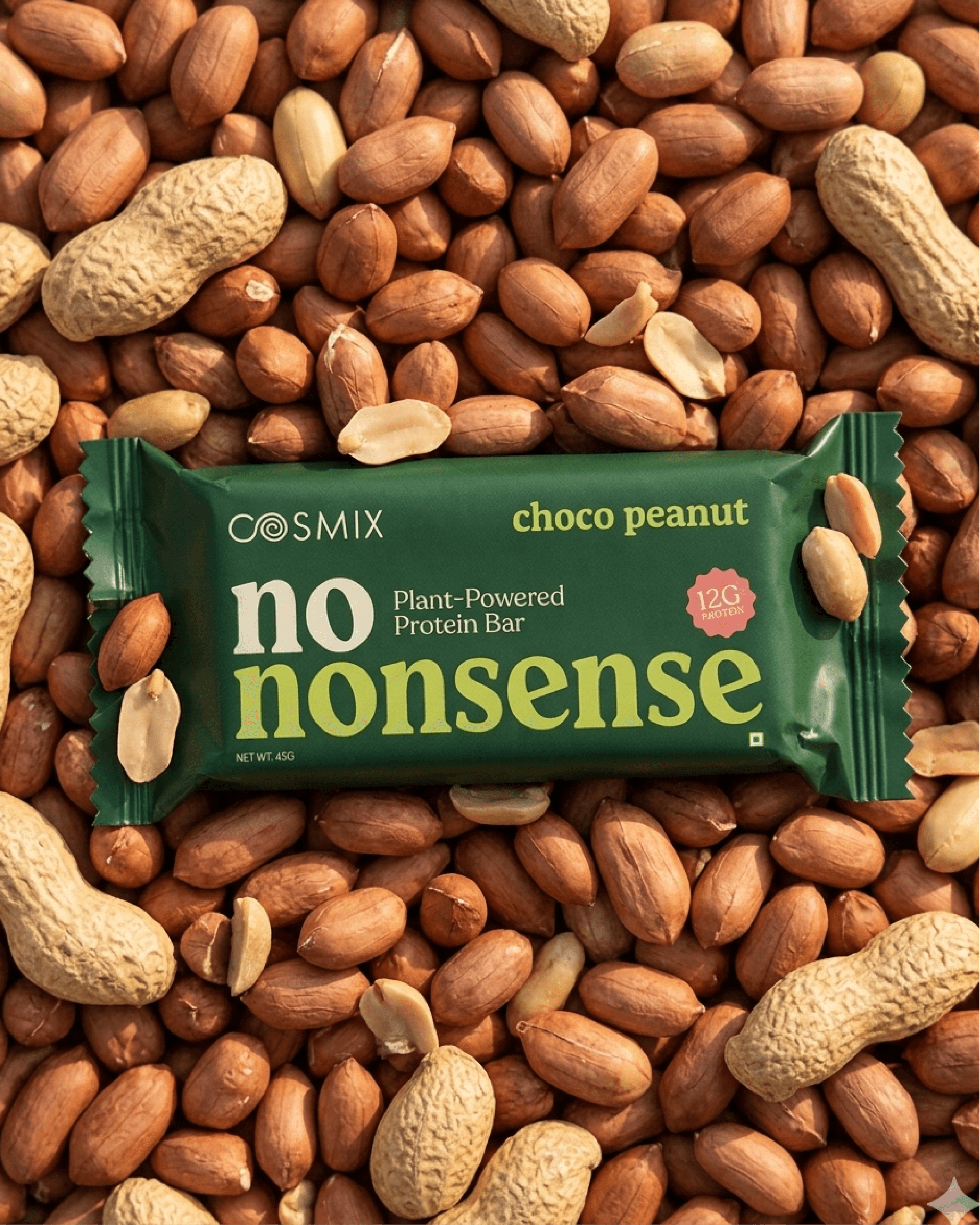
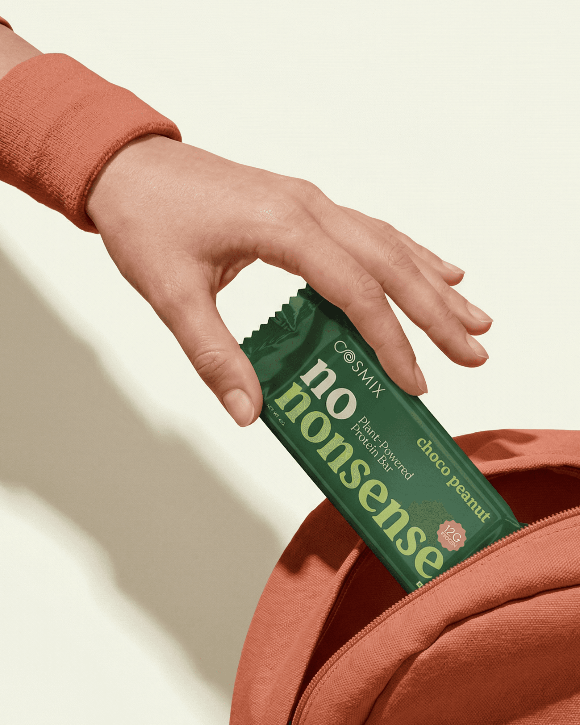
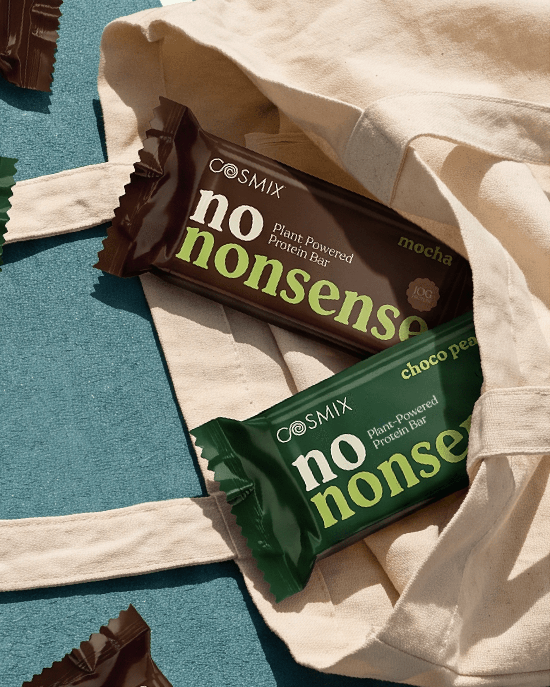
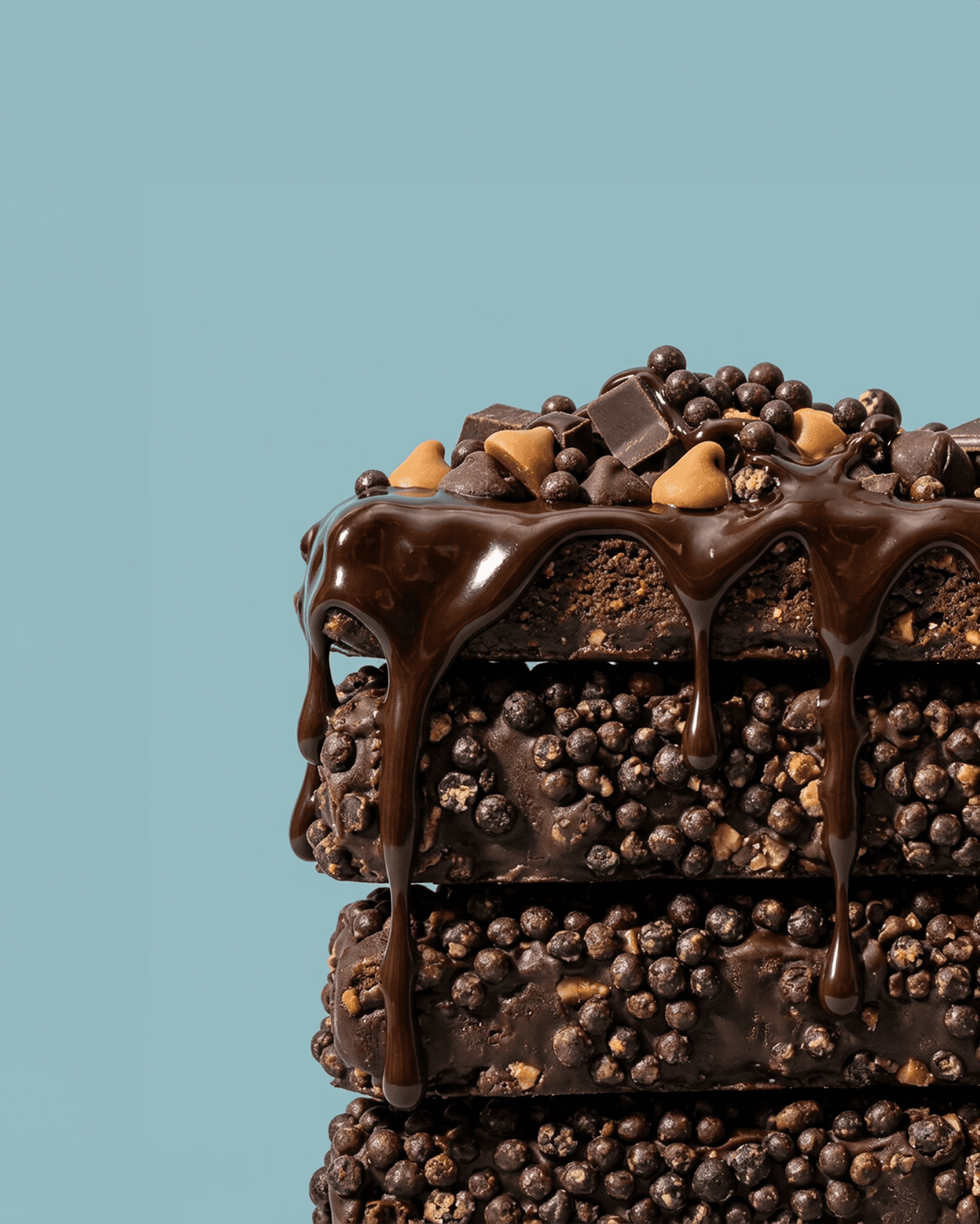
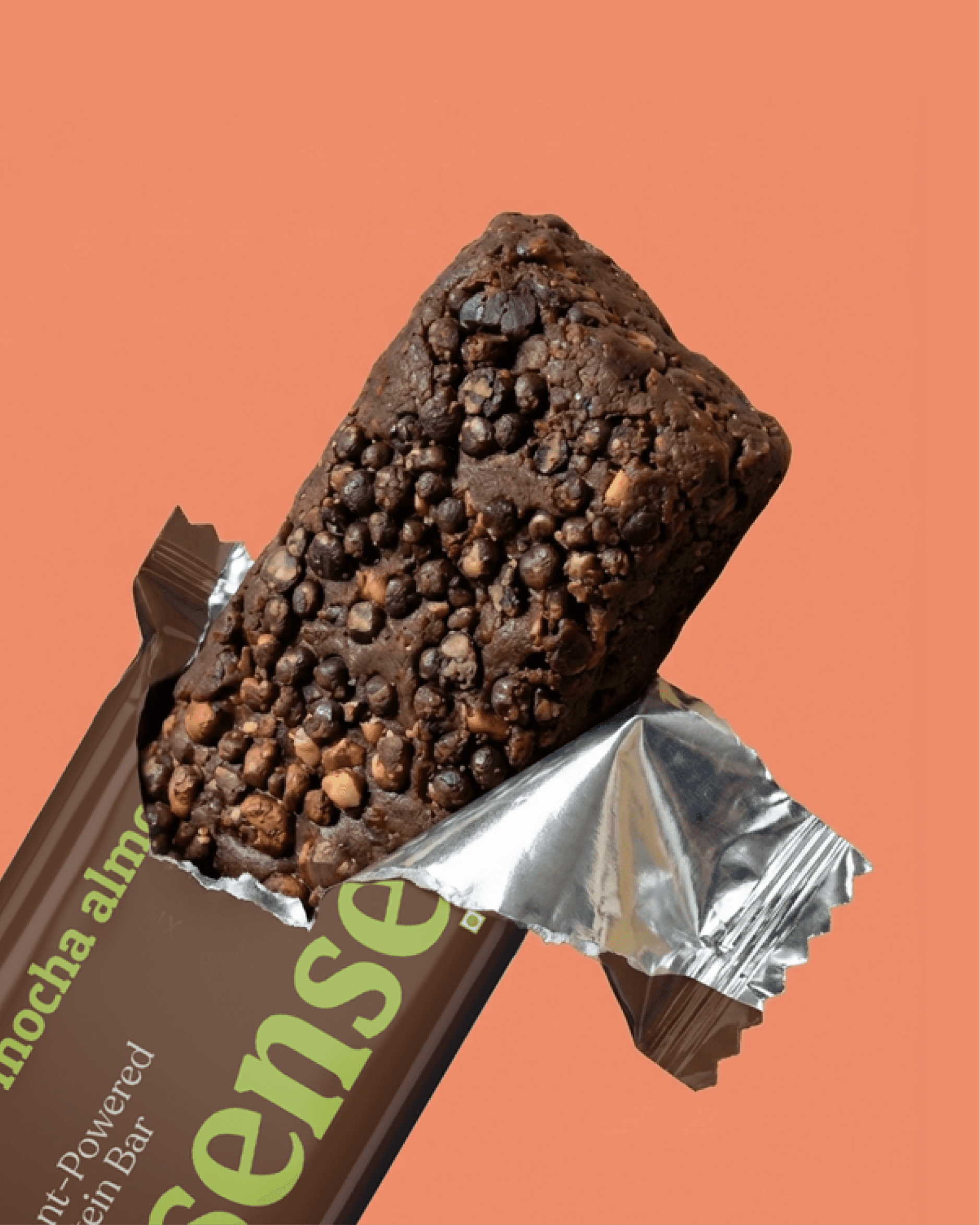
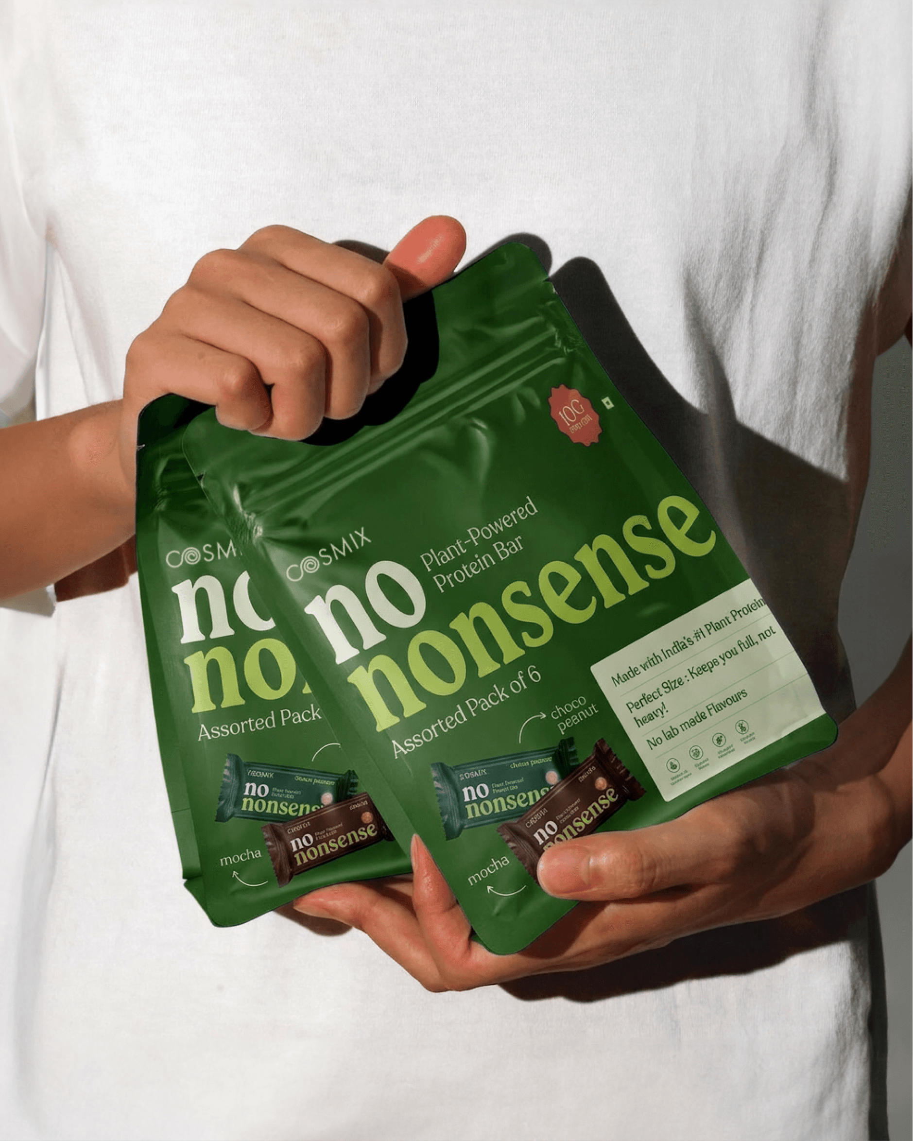
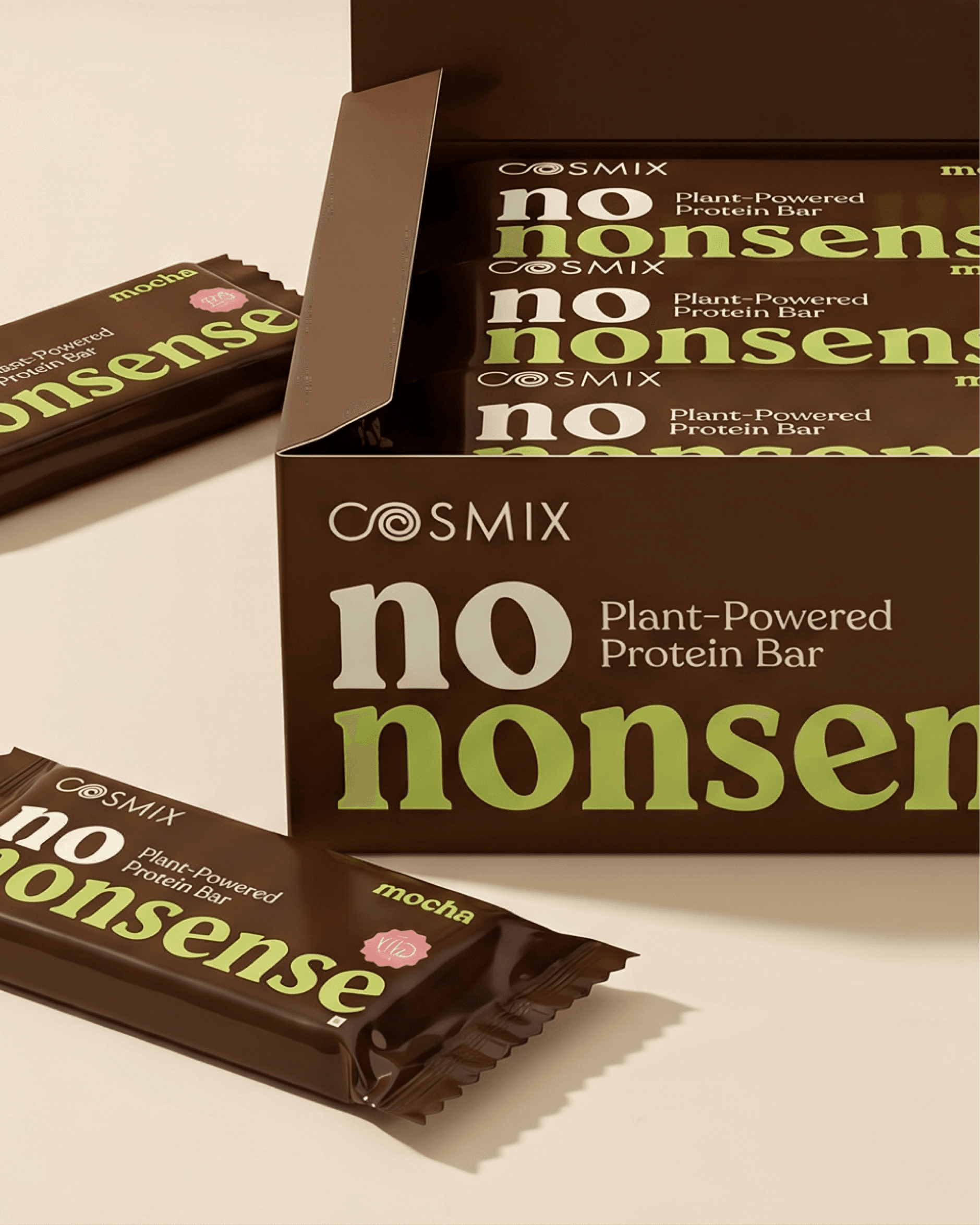
The health space is crowded and protein bars might be its loudest corner. Every product is fighting for shelf space with the same playbook: bright colours, bold claims, maximum everything. Cosmix had already built something different : a restrained, considered identity that felt calm in a category that rarely is. The challenge with their new plant protein bar line wasn't just packaging. It was packaging that could compete without compromising.
The answer wasn't to turn the volume up. It was to turn it up selectively. Structure, typography, and considered colour did the heavy lifting, creating packaging that reads as confident rather than chaotic. Something that earns a second look without demanding it.
Client
Cosmix
Services
Packaging Design
Year
2025
Work Produced For
Coconat Creatives